
No matter how much traffic you manage to get from Google or your other marketing or advertising efforts, the truth is that it’s all pointless if you fail to get visitors to convert and become leads.
People will scroll up and down your web pages looking for a solution to their pain points, but if you don’t explicitly tell them what to do next, they won’t know what action to take, how to do that, and what outcome they can expect.
Enter the call to action or CTA.
This tiny website element is responsible for a huge portion of your conversions; therefore, it deserves some extra TLC.
Here are some call-to-action button design tips that will get your website visitors to click and boost our conversion rate.
1. Minimize Clutter Around the Button
CTA buttons need to be conspicuous.
Moreover, a CTA should be one of the first things your visitors spot when they land on your website, regardless of whether it’s your homepage, a dedicated landing page, a product page, or even a blog post.
So, visibility is a critical factor when it comes to the effectiveness of your call-to-action buttons.
Start by decluttering the surrounding area by leveraging white space. If your CTA is buried in a large block of text, the odds are visitors will have a hard time noticing it. Also known as negative space, this powerful design element eliminates all the noise and distractions and makes your call to action stand out.
The fact that it’s unoccupied by other design elements or website copy will catch the eye of every visitor and immediately show them where their focus should be.
Finally, white space doesn’t necessarily have to be white — you can opt for any color you like to make your CTA more visible.
Lyft’s homepage is a great example of the “less is more” approach to design. A clear and balanced background, unburdened by too much content, allows them to smoothly direct visitors’ attention toward the CTA and quickly get to the point. The messaging is succinct, and it’s easy for potential customers to understand what they should do next, depending on what they need — get a ride or apply to drive.
2. Highlight Savings or Discounts
It’s a truth universally acknowledged that people love discounts.
The idea of getting a good bargain is appealing as most consumers feel better when they manage to get their hands on an item they have been eyeing for a fraction of its original price. It makes them feel they can have their cake and eat it too.
Stats say that 64% of online customers wait for a price to drop before they decide to purchase something. So it’s obvious why emphasizing such incentives on your call-to-action buttons is a must.
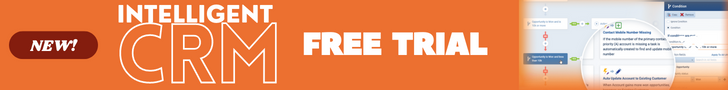
Another tactic that will make your potential customers grab their credit card and make a purchase is the inclusion of two simple words in your CTA copy — Free Shipping.
According to surveys, 80% of people expect to get free shipping on purchases over certain amounts, and if the merchant doesn’t offer this option, they won’t hesitate to abandon their shopping cart and look for a more generous deal.
So, it’s crucial to draw visitors’ attention to the fact that they can save their money and conspicuous CTAs serve this purpose perfectly.
MarketBeat’s High Yield Dividend page features a clever “Free Trial” CTA button that allows visitors to see how the service works before committing. This way, they can rest assured that the product or service fits their needs and that they won’t waste their money if they decide to buy it. The addition of the $ icon is a detail that further underscores this offer.

Birchbox has a cool loyalty program allowing their customers to get 10% back on each purchase. A CTA on their homepage showcases this offer and prompts customers to explore it further.
Place Buttons Above the Fold
Visibility is critical when it comes to critical web page elements.
For a CTA button to be effective, it has to catch the eye of your visitors. Placing one in the page header maximizes this chance. Let’s not forget that visitors, on average, spend 54 seconds on a web page, and if they don’t see your call to action, they probably won’t convert.
Although spending almost an entire minute on a page seems like enough to find what you’re looking for, visitors will usually scroll up and down and notice only conspicuous details.
In other words, placing your CTA above the fold will make it instantly visible and top of mind with your visitors.
Also, some people read and scroll fast, while others take more time, so it’s best to cater to both groups and include more than one CTA. Depending on the page length, you can add multiple CTAs with the same offer so that you can cover both skimmers and careful readers. For example, if there’s a lot of content on the page, you can also include one CTA in the middle, and one at the bottom, so that visitors don’t get too distracted and forget to convert.
When visitors land on the Career Sidekick homepage, they will spot the CTA right off the bat. The brand uses messaging elements incredibly sparsely above the fold and wastes almost none of the real estate on components that compete for attention with the CTA.

Supersize Your Buttons
Large CTA buttons are hard to ignore, and that’s exactly the effect you want to achieve.
There are different ways to make your CTA stand out, and supersizing both the button and the text is one of them.
First of all, this way, you’ll make your CTA more prominent so that your visitors’ eyes will naturally gravitate toward and ultimately interact with it.
Secondly, it will be easier for people who are accessing your website from their mobile devices. With a larger CTA, they can click without having to pinch and zoom. And if we bear in mind that mobile accounts for more than 60% of all web traffic, it’s obvious that paying attention to this detail can bring you more conversions.
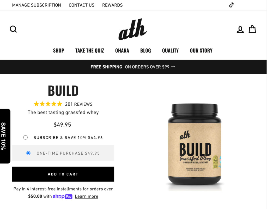
For example, ATH’s Grass Fed Whey Protein sticks with the same colors as the site but makes the CTA stand out with its size. Also, the button is black with no other elements in that color around it, while the background is white, thus adding contrast to the entire design.
Make the Value Obvious
If you want your CTA to be irresistible, it’s essential that the copy clearly communicates the value.
When presented with an offer, your potential customers won’t immediately say yes without thinking about what’s in it for them. Therefore, your task is to highlight the benefit or value prospects will get by clicking on the CTA and accepting what you offer.
Don’t be subtle about this — tell them why they should take action without delay.
This can be some of the incentives we mentioned, such as “Save 25% Now” or “Subscribe for Free.” But you can also get creative and let your potential customers know how clicking on the CTA and accepting your offer will improve their life or help them fix a problem or achieve a goal.
Missinglettr homepage CTA is a great example of communicating a value proposition in an impactful manner. Instead of asking their potential customers to “Sign Up” for their service or “Click to Sign Up,” they opted to add more punch and highlight the expected outcome by saying “Start Growing My Brand.” Using the first-person pronoun makes people feel more connected to the service and involved in the process.
Create a Sense of Exclusivity
The trick to getting more clicks is making your audience feel special and creating a sense of exclusivity with your call to action.
This means implying that a certain offer has been created for them specifically and isn’t available to other people. This VIP treatment will encourage your customers to take action and enjoy this special offer.
To speed up their decision-making, create urgency with your CTA copy. Gently warn your customers that this awesome deal won’t last forever and that they should act quickly before it’s gone.
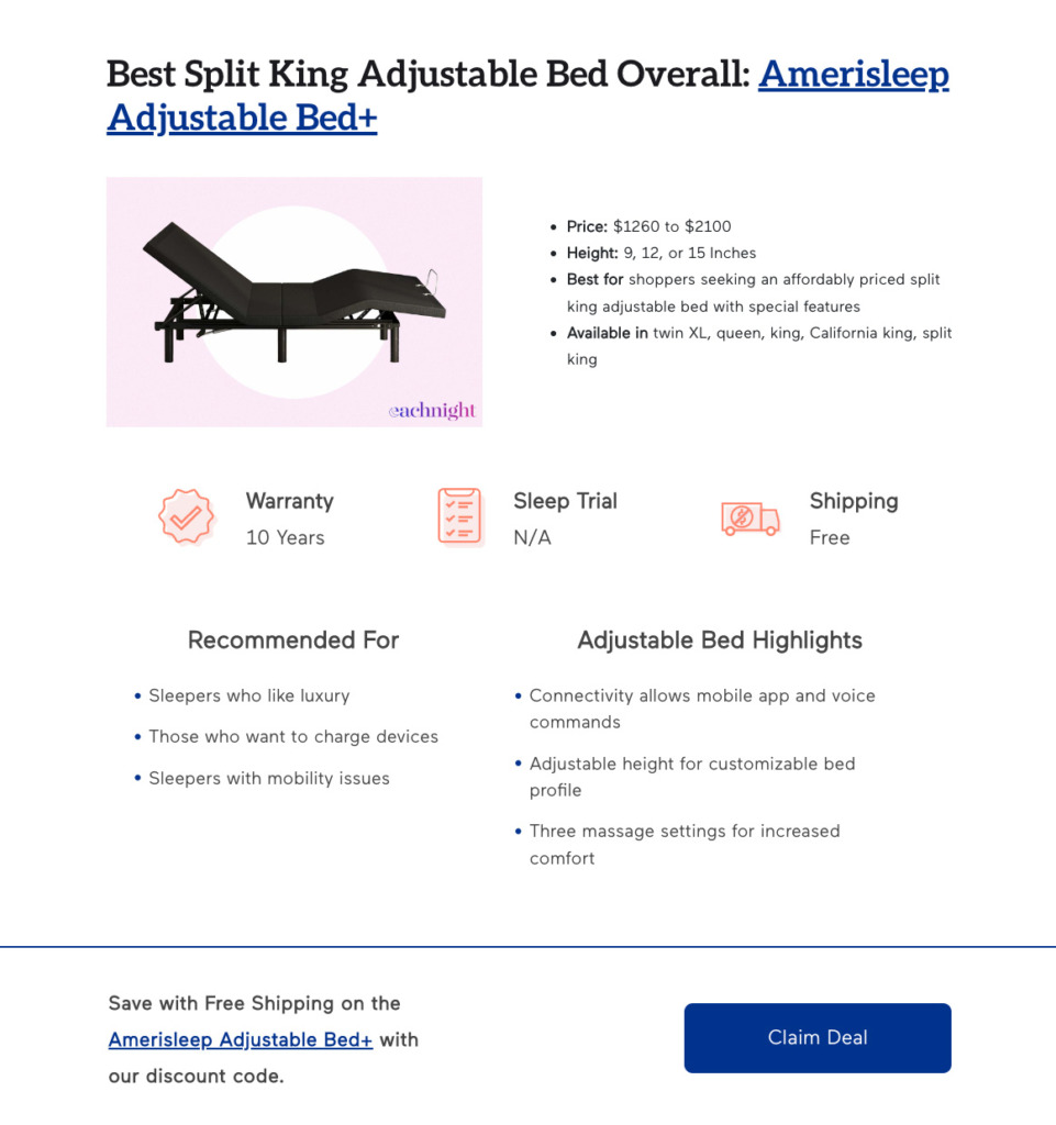
The CTA within Eachnight’s guide on the best split king adjustable beds leverages this approach. Their button label “Claim Deal” creates a sense that this is an offer created just for the shopper reading it. This copy insinuates that the deal in question has an expiration date, meaning that it would be best for the customers to bag it as soon as possible.
Address Conversion Obstacles
So, you’ve implemented all the CTA tips we discussed in the previous sections, and yet your conversion rates leave too much to be desired.
What else can you do?
Address and eliminate conversion obstacles.
Customers are impatient to start using a new product or service. In other words, a lengthy registration or checkout process will put them off completing their conversion. Asking for a credit card number when you’re offering a free trial is perceived as a nuisance. A number of potential customers will certainly give up before they even give your solution a try.
Take a cue from DoneDone and optimize your conversion rates by letting your customers know that they can sign up for a free trial without a credit card. The brand takes this tactic to the next level by actually including this message in their homepage CTA copy.
Piktochart’s homepage features a CTA button that:
a) leverages social proof by inviting customers to join 11 million other users, and
b) simplifies the signup process by allowing customers to sign up with Google or email.
This way, the brand eliminated two major conversion killers — lack of trust and a complex signup flow.

Carefully Consider Your Messaging Around the CTA
A minimalist approach doesn’t work with all sites or brands. In fact, depending on your target audience and the way you sell to them, placing a few important messages in the vicinity of the CTA might be a very smart thing to do.
Think about what your audience wants to know and what you want them to know as they’re tempted by the CTA. This is especially important if the button is very conversion-focused, for instance, if it links to a product or product category page.
If this is the case, what are the thoughts you want to place in your potential customers’ minds?
Let’s take a look at ShopSolarKits as an example. The B2C brand is selling a highly niche, pricey product that not many shoppers will be familiar with. Switching to solar power is a big decision that needs a bit of nurturing.

This is why the site placed several important messages around their primary CTA:
- Social proof: “30,000+ Happy Customers”
- Product’s main benefits: “Off-Grid, Hybrid, Portable & Emergency”
- Trust claims that cover: shipping, guarantees, and customer support.
Years of interacting with their customers would have informed the decision on which messaging to include here. If you feel that your CTA could do with this kind of support, don’t guess what your prospective customers would want to know. Base these decisions on the questions they ask your sales staff or on research you’ve done on their pain points.
Always Be Testing
This is a critical step to your CTA optimization as it allows you to test and compare the performance of two different versions of a particular call to action. If you create a single version and stick to it, you’ll never know whether a different color, size, or some other characteristic of your CTA would perform better.
For example, you can test the design, copy, and placement of your call to action and use the version that gets more clicks.
The beauty of this tactic is that you can additionally tweak every version and a separate CTA element all over again until you hit the sweet spot.
In Closing
Optimizing the design of your call-to-action buttons is critical to increasing your conversion rate. Unless your CTAs are highly visible, actionable, and value-oriented, your customers won’t be motivated to take action. By following these simple tips, you’ll transform your CTAs from “meh” to “wow,” which means they’ll generate a lot of clicks and conversions.


Comments