A great landing page has the power to increase conversions exponentially and turn your marketing campaign from a dream to a success. To achieve this, you need to know what makes a landing page outstanding. Studying some of the best landing page examples from across the internet is an excellent place to start.
This post delves into the finer points of what a landing page is, the key components of a high-converting landing page, and examples of the best landing pages from the World Wide Web.
A landing page is a web page designed to encourage your target audience to execute a particular action and generate leads for your business. Some examples include landing pages for downloading a digital asset, registering for a webinar, or signing up for a free product trial.
Although you’ll typically host your landing page on your company website, it’s more than just another web page. While web pages often detail information about different products and services with varied calls to action (CTAs), landing pages have a clear and singular purpose.
You would design a landing page for a goal-specific promotional campaign, using the page to communicate a concise and impactful message and one CTA. Delivering uncluttered messaging in this way typically leads to higher conversion rates because the audience is less distracted and understands exactly what you want them to do.
That said, successful landing page design follows a proven formula, comprising elements that nudge the audience toward conversion. When businesses ignore this formula, they end up with costly promotional campaigns, elevated bounce rates, and fewer conversions.
Make sure your audience immediately understands your offer and its benefits by including your value statement at the top of your landing page. This statement should be above the fold so that users understand your value proposition without having to scroll further down the page.
Stipulating your unique offer and its advantages from the start is the best way to grab and hold your audience’s attention. Providing clear and concise messaging in this way will reduce bounce rates and increase your chances of gaining more conversions.
Align your headline with your ad
Regardless of how you promote your landing page, your visitors must click on some form of promotional content or advertisement to reach the page. Make sure that your landing page headline and the wording used in your advert let the audience know they’ve landed on the correct page.
It’s also a great way to maintain buyer journey momentum, taking them from their initial interest when clicking through to converting via your CTA. Ensuring your landing page headline relates to your ad copy reduces confusion, reinforces relevance, and increases conversion rates.
Add testimonials and trust signals
Including customer testimonials and reviews is one way to showcase social proof to your landing page visitors and build trust. It reassures them you’re a legitimate business with a proven track record and satisfied customers.
We also recommend including trust signals such as endorsements, accreditations, and awards where possible to establish credibility with your audience. Incorporating social proof and other trust signals will give your landing page a better chance of bringing in those conversions.
Include a single offer
While getting the most from your target audience when they view your landing page is tempting, it can be detrimental to your campaign. Highlighting two or more offers on a single landing page can confuse visitors and harm your conversion rates.
When faced with more than one offer, the audience might be distracted and fail to take either action. A single offer provides clarity and streamlines the decision-making process, leading the visitor to your CTA, where they’re more likely to convert.
Highlight your CTA
The objective of your landing page is to get your audience to take a specific action, and you should design the page with this in mind. Making the page visually appealing through a clean and modern layout and the use of color and white space is one aspect of a remarkable landing page design.
Another primary aspect is drawing your visitor’s attention and directing them toward your CTA, whether through directional cues, a contrasting button color, or the like. Bringing these tactics into your landing page design strategy is the ideal way to ensure a pleasant user experience and gain more conversions.
Use pertinent imagery
Including striking visual elements is an excellent way to grab your audience’s attention and enhance the overall landing page experience. But be careful not to let your visuals detract from your intended message and the purpose of your page.
Use illustrations, photos, and videos strategically in a way that supports your landing page message and reinforces your brand image. Most of all, ensure these visual elements don’t overshadow your CTA, which must always stand out as the focal point of the page for the best conversion rates.
Write engaging headlines and copy
Your headline is the first thing your visitors will see, and your landing page copy will convey your offer and how your audience will benefit from it. As such, these elements should be concise and impactful, ensuring you garner and hold the audience’s attention.
The copy and headline play an integral role in selling your value proposition. When combined with your visual elements and trust signals, they should lead your audience directly to your CTA and encourage them to take action.
Optimize through A/B testing
Evaluate your audience’s response to your landing page when you tweak the visuals, headlines, CTAs, and more. Making adjustments and monitoring landing page traffic, engagement, and conversion rates for different designs gives you insight into what your visitors prefer.
You can use this feedback to optimize your landing page for the best possible conversion rates. However, bear in mind that you should only change and test one specific page element at a time. If you make several changes per test, you’ll never know which specific element contributed to your increase or decrease in conversions.
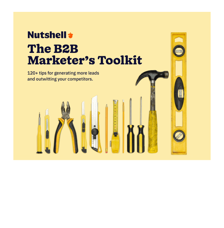
DOWNLOAD
Want to generate more leads? (Of course you do.)
The B2B Marketer’s Toolkit collects 120+ of the best lead generation tips ever published on the Nutshell blog. Download it today!
You know what it takes to create a killer landing page that brings in quality leads. Now, let’s take a look at some top-notch, high-converting landing page examples to give you some inspiration before diving into designing your own.
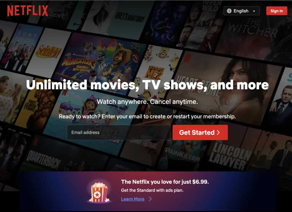
1. Netflix
The Netflix landing page is first on our list. This household name in on-demand entertainment delivers a simple, uncomplicated landing page, getting straight to the point. In the background is a collage displaying images of some of the world’s most recognizable movies and TV shows, which lets you know that Netflix has the best entertainment on offer.
Despite the succinct headline and copy, Netflix manages to provide visitors with information regarding exactly what they offer, where you can access their services, how subscriptions work, and subscription pricing.
The highlight of the landing page masthead is the large red “Get Started” button next to a singular form field requiring visitors to input their email address before clicking the button. At a glance, you know exactly what Netflix will provide, understand how to obtain it, and have an easy way to get started.
With zero confusion or obstacles to taking action, it’s clear why Netflix’s landing page results in a high level of conversions.
2. Muzzle
Muzzle’s landing page teaches us how to use whitespace to your advantage, making their CTA the most prominent element on the page, as it should be. This simplified design might not seem like much on the surface, but for visitors who have clicked on a paid or organic link and arrived at this landing page, there’s a wealth of information.
Muzzle is an app built for Mac users that hides and silences pop-up notifications from your phone, email, and more while you’re sharing your screen. The Muzzle team uses a short and sweet sentence between their brand name and the CTA button to drive home the company’s value statement. And they provide some more details below the CTA, letting you know that their app works with a host of screen-sharing software.
To the right, Muzzle has added three notification examples depicting embarrassing and somewhat humorous messages you definitely wouldn’t want popping up while sharing your screen. These realistic examples are sure to resonate with their target audience and encourage them to hit that hard-to-miss download button in the center of the screen.
3. Wix
This Wix landing page offers us another example of an effective minimalist landing page design. Another household name for anyone with a YouTube account, Wix is one of the most popular website-building platforms for businesses and individuals.
Completely free of distractions, apart from the beautiful illustration in the background, Wix opens their landing page experience with a bold statement headline: The Leader in Website Creation. Below the headline is an unmistakable “Start Now” button, offering visitors a clear call to action, knowing they are about to sign up for a world-class website creation service.
The unique and compelling background illustration serves the purpose of drawing the audience’s eye down the page. As we scroll down, following the illustration, the page reveals more information about the website templates, easy-to-use web builder, mobile functionality, and custom domains offered by Wix.
At every point in your journey down the page, Wix ensures there is a clear and obvious CTA button, ensuring landing page visitors know exactly how to sign up for the services offered.
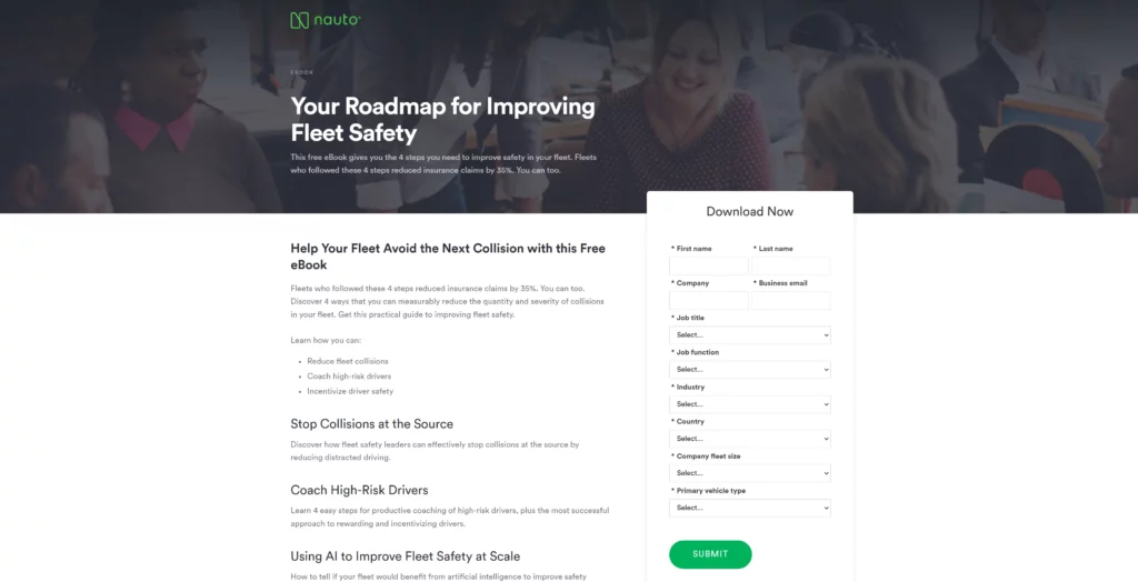
4. Nauto
The era of self-driving cars is upon us, and Nauto is a data platform leading the charge in fleet management and driver safety for these cars. Nauto’s landing page for their fleet safety eBook download is the perfect example of how to capture leads using gated content.
Its simple yet sophisticated design brings the all-important download contact form front and center. The company has also chosen a neutral color palette of white and black and a dark grey filter over the masthead image. This ensures that the vibrant green “Submit” button is highly prominent.
What’s left of the above-the-fold section is dedicated to providing visitors with crucial information about self-driving vehicle safety and how the eBook will benefit fleet managers and their teams. And while the form includes 10 required fields, six of them comprise short dropdown menus for you to pick your answer from, making it easy to complete.
5. Storyworth
Storyworth offers a unique gift for those who want to share and preserve the words and stories of their loved ones. With a Storyworth membership, you can send weekly questions to someone over a period of a year. That person responds each week via email, and Storyworth collects the responses to compile a keepsake book to gift or hold on to.
This landing page introduces their target audience to their one-of-a-kind service, with the hope that visitors will click on the unmissable “Buy now” button to subscribe. Storyworth does a fantastic job of explaining its product and service in a concise manner within the masthead.
The company also includes two important trust signals—information about its rating and reviews on Trustpilot and logos representing renowned media channels that have featured Storyworth, like CNN and The New York Times.
The masthead image is a carousel featuring four images displayed one at a time, which showcase examples of the end product and pull at the heartstrings. Scrolling down, you’re met with images of books completed by customers, giving you some ideas of the types of stories you can collect and share.
Further down the page, Storyworth highlights some of the benefits its gifts provide to families and breaks down the steps involved in creating your own book of memories. Apart from the obvious “Buy now” button at the top, you’ll find prominent CTA buttons placed strategically at different points as you scroll down.
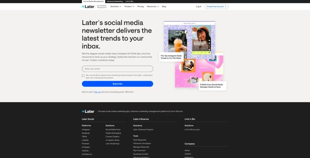
6. Later
No list of landing page examples would be complete without a newsletter subscription page example. Social media marketing platform Later shows us how to create an effective landing page for one of the most popular landing page conversion goals.
Later’s entire landing page fits above the fold, so there’s no scrolling needed, which means fewer obstacles preventing the target audience from signing up. The minimal copy gets right to the point, describing what you’ll get if you subscribe to Later’s social media trends newsletter.
Signing up is a breeze and only requires you to input your email address and hit the “Subscribe” button. With a clear path to subscribe and zero distractions, Later is bound to see a high conversion rate with this landing page.
Another element that sets this page apart is the visuals Later incorporates. While the company takes full advantage of the power of whitespace, it includes a few visuals that give visitors a peek at what they can expect from Later’s newsletter.
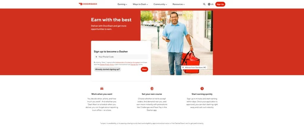
7. DoorDash
World-famous food ordering and delivery platform DoorDash has a few different landing pages targeting prospective drivers, or Dashers, all of which are worthy of a place on this list. This particular version stands above the rest for several reasons.
DoorDash hits home with a bold headline and opening statement, touching on the primary pain point experienced by jobseekers—the need to earn. Right below that and still above the fold is a noticeable CTA block, which simply asks those interested to input their postal codes and click “Next” to start the application process.
The company goes on to highlight three core benefits associated with being a Dasher in its hero copy. Again, these tap into potential pain points, such as the need for flexible work hours, independence, and control over how they earn.
As you scroll down the page, you find plenty of information related to what you would expect prospective applicants to ask, including how much you could earn, delivery safety procedures, and eligibility requirements.
One of my favorite things about this landing page is the masthead image, which depicts an actual Dasher: Alfonso from Davidson. The image adds a relatable personal touch.
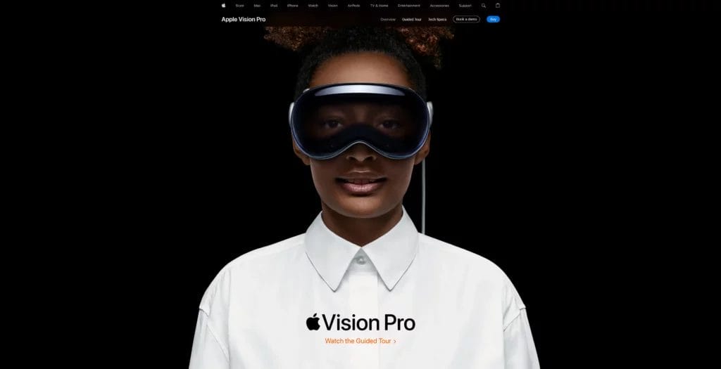
8. Apple Vision Pro
As we approach a future where virtual reality is an everyday technology, tech giant Apple is making significant strides regarding VR devices. Its latest release is the much-anticipated Apple Vision Pro, and the company has designed an amazing landing page to promote the device.
Granted, Apple is in a league of its own and requires little more than the unmistakable Apple logo for an audience to understand the product in question. Rather than bombarding us with Vision Pro features and benefits upon entering the page, Apple simply offers us an immaculate, high-res head and shoulders image of someone wearing the device.
The company includes the Apple Vision Pro logo just above the fold with a CTA below the logo to “Watch the Guided Tour.” The CTA takes visitors to a page with a guided tour film and a few other informative videos.
As visitors scroll further down this landing page, they’ll discover details about Vision Pro features and benefits, along with large-format video clips showcasing each. Ultimately, this page includes everything you need to know about the Apple Vision Pro, and, as such, it’s by far the longest landing page on this list.
Despite being such a comprehensive landing page, Apple displays the information concisely with loads of white space and oversized video and imagery that is easy to digest. This stunning landing page compels visitors to click on the CTA and watch the guided tour to discover more about this impressive device.
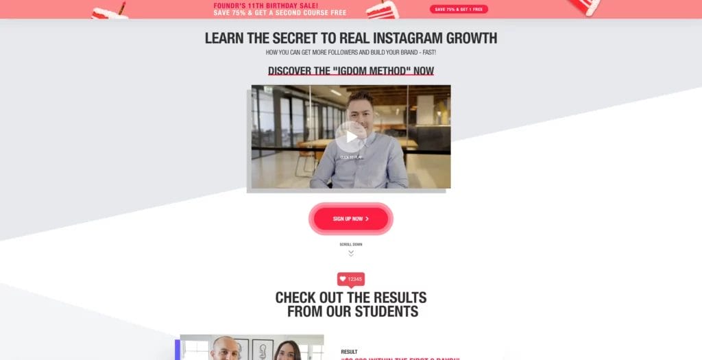
9. Foundr
We just had to include a course-related landing page example with this Foundr Instagram Domination course page. Course promotion is another common use for landing pages, and Foundr does a stellar job of drawing the audience’s attention and leading them to the CTA to convert.
While there’s a ton of information above the fold, Foundr manages to display it all effortlessly in a visually appealing manner. The page’s headline and hero copy tell you precisely what you’ll receive when signing up for this course, so there’s no confusion there.
Upon entering this page, your eye immediately falls to its center, where the company provides an embedded introductory video and a large, bright red, pulsating “Sign Up Now” button that is hard to miss. So, there are zero distractions, and there’s a clear direction for visitors in terms of what to do next.
If visitors need more information, they can always scroll further down the page where Foundr provides video testimonials from several of the course’s successful students. You’ll also find more details about the coach, different modules, and pricing related to the course.
With all this valuable information, a strategically placed CTA, and heaps of social proof as trust signals, Foundr is bound to gain plenty of students and leads for future communications.
Boost your marketing campaigns with Nutshell Landing Pages
If you’re on the hunt for a quick and easy way to design high-converting landing pages like a pro, Nutshell has you covered. With Nutshell’s Landing Pages, Nutshell customers have the tools needed to acquire more leads from paid and organic search visitors.
Drag-and-drop designing: You don’t need any coding knowledge to design professional-looking landing pages that turn visitors into quality leads.
Pages hosted on your domain: While you’ll create your landing pages in Nutshell, you can link your domain to host those pages on your website when published.
Custom layouts and designs: Start from scratch or use our customizable templates to create high-converting pages that align with your brand image.
Key engagement metrics: We’ll track your landing page engagement and provide you with essential metrics you can use to optimize your campaigns.
Sync with Nutshell tools: Combine Landing Pages with your Nutshell Scheduler and Nutshell Forms for a powerful visitor conversion trifecta.
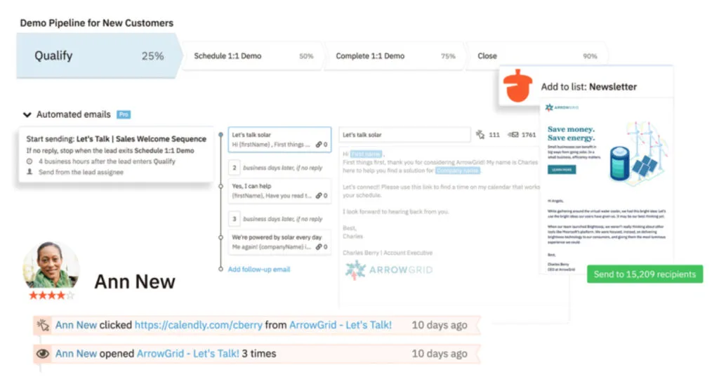
The beauty of Landing Pages is that it’s connected directly to your CRM software. That means you can easily capture leads and add them to custom pipelines with automated processes to help you nurture and convert prospects into customers.
As a bonus, customers on a Nutshell Pro plan and up can access three free Nutshell marketing-only seats. These individuals can use all the tools within Nutshell’s marketing section, including Landing Pages, at no additional cost.
Not a Nutshell user yet? Sign up for a free 14-day trial today—no credit card is required. If you’d like to discuss your options with an expert, get in touch with our team for more information about how Nutshell can help improve your business’s productivity and profitability.
Try Nutshell and Landing Pages for free
Give Nutshell CRM as well as Landing Pages and our other marketing tools a try by starting your 14-day free trial today.